
Pikaku is a React Native app designed for a candy shop in Mexico City. The app helps the shop achieve its growth plan by offering better services to its current and new customers. It also allows users to maintain healthy habits by keeping track of the calories in the products they consume.

RESEARCH
SUMMARY
To understand pikaku’s problem first I conducted interviews to find the main issues. Then I did a second set of interviews and created empathy maps, to understand the main challenges that they are facing to provide excellent customer service.
Most of their clients are young people with tight schedules, so the main research findings showed that they don’t have enough time to go shopping when they want a snack and it’s frustrating for them because they also have indirect expenses in time and resources to go shopping. Clients also mentioned that they would like to have tools to keep their healthy habits and another issue is the distance they have to move to buy their products and also that similar platforms exist and are overcomplicated or unreliable.

INTERVIEWS
To gain a deeper understanding of Pikaku’s services, it was essential to explore the offerings in detail. This required conducting interviews with Pikaku’s owner and seven clients to gather insights into their perceptions, objectives, and desires.
Pikaku’s owner emphasized the need to provide a sales channel that would simplify the buying process, making it easier for clients to acquire products and thereby expand the business’s reach.
Pikaku’s clients mentioned various reasons for purchasing snacks from the store, with all of them highlighting the freshness and quality of the products. However, more than half of the clients also expressed feelings of guilt about consuming the snacks quickly and making frequent visits to the candy shop. They also suggested uploading the inventory to digital platforms to make the buying process easier when they have a craving.
BRINGING ALL THE INSIGHTS TOGETHER
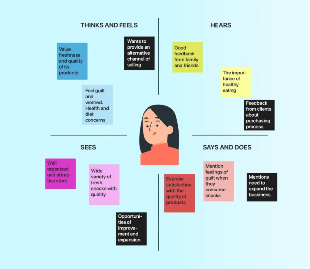
After the first set of interviews, it was necessary to filter the most important information. By identifying the most recurrent topics, an empathy map was created to address the main issues concerning Pikaku’s services. This map helped to visualize the clients’ experiences, needs, and emotions, providing a clearer understanding of how to improve and tailor the services offered.

SECOND SET OF INTERVIEWS
After the initial round of interviews, it became apparent that there was a pressing need to delve deeper into the issue of creating and maintaining healthy habits while consuming Pikaku’s products. Therefore, a second round of interviews was conducted to gain a more thorough understanding of this concern.
Among the seven clients interviewed, three mentioned the necessity of monitoring their caloric intake. They expressed concerns about consuming candies and snacks due to the high calorie content of these products. On the other hand, the remaining four clients admitted that they don’t actively track their calorie consumption but still expressed worries about the potential health problems associated with consuming high-calorie products.
This feedback highlights a significant challenge for Pikaku in addressing the health-consciousness of its clientele. It underscores the importance of offering healthier snack options or providing transparent nutritional information to assist customers in making informed choices about their consumption.

SECOND SET OF INTERVIEWS I
In this second set of interviews, clients emphasized the importance of having an alternative sales channel to make the buying process more accessible. They highlighted the significance of saving time, especially when they only want to acquire a few snacks to satisfy a craving or share at an event. Therefore, a home-delivery service would be desirable to help them save time and enhance convenience. However, they also mentioned that home delivery services on platforms like Uber or DiDi are overcomplicated, sometimes do not cover certain locations, and can be very expensive.
The challenge identified in the interviews revolves around the limitations of existing home-delivery services. Clients find platforms like Uber and DiDi to be overcomplicated and unintuitive, which detracts from their user experience. Additionally, these services can be prohibitively expensive and often do not cover all locations, making them unreliable for some customers. This highlights a significant gap in the market for a more user-friendly, affordable, and widely available delivery service tailored to meet the specific needs of clients looking for quick and convenient snack purchases.


PROBLEM STATEMENT:
Mariana is a professional dancer who is always saturated between events and calls and needs an easy way to order customized snacks and at the same time keep her healthy habits because she is worried about affecting her health when she is eating candies and snacks.
SECOND SET OF INTERVIEWS I
In this second set of interviews, clients emphasized the importance of having an alternative sales channel to make the buying process more accessible. They highlighted the significance of saving time, especially when they only want to acquire a few snacks to satisfy a craving or share at an event. Therefore, a home-delivery service would be desirable to help them save time and enhance convenience. However, they also mentioned that home delivery services on platforms like Uber or DiDi are overcomplicated, sometimes do not cover certain locations, and can be very expensive.
The challenge identified in the interviews revolves around the limitations of existing home-delivery services. Clients find platforms like Uber and DiDi to be overcomplicated and unintuitive, which detracts from their user experience. Additionally, these services can be prohibitively expensive and often do not cover all locations, making them unreliable for some customers. This highlights a significant gap in the market for a more user-friendly, affordable, and widely available delivery service tailored to meet the specific needs of clients looking for quick and convenient snack purchases.
DESIGN PROCESS
INTRODUCTION
Once the investigation process allowed us to find improvement points and confirmed the main hypothesis that a digital product could help to improve the client’s experience and help to grow Pikaku’s presence. We proceed with the design process which started with a series of paper wireframes and then digital wireframes that helped us to verify some user interactions with the product and then design some mockups and high-fidelity prototypes to create the MVP and validate the product usability.
STARTING THE PROCESS
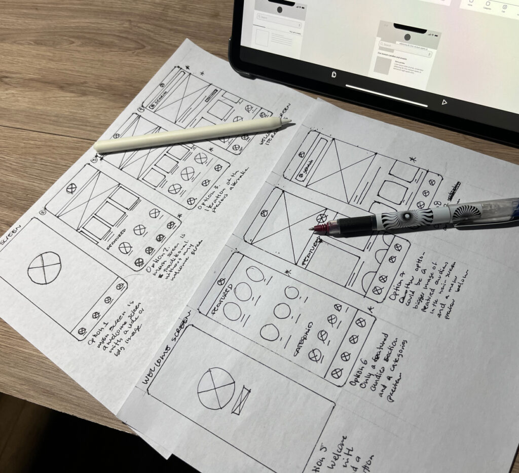
To start the design process, I decided to explore different home screen alternatives and arranges, prioritizing a friendly welcome screen and a synthesized menu that could allow the user to familiarize themselves with Pikaku’s product and allow easy navigation. After the home screen configuration was finished then I did some wireframe designs to propose a starting flow interaction.
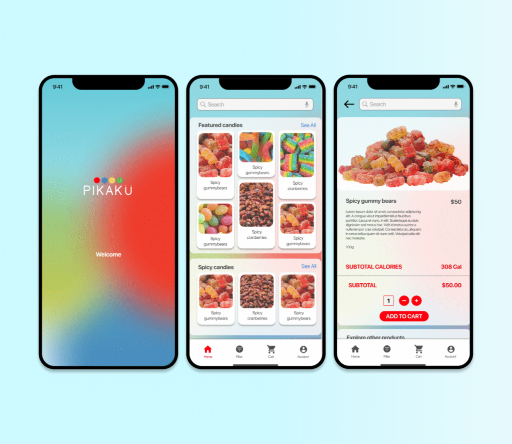
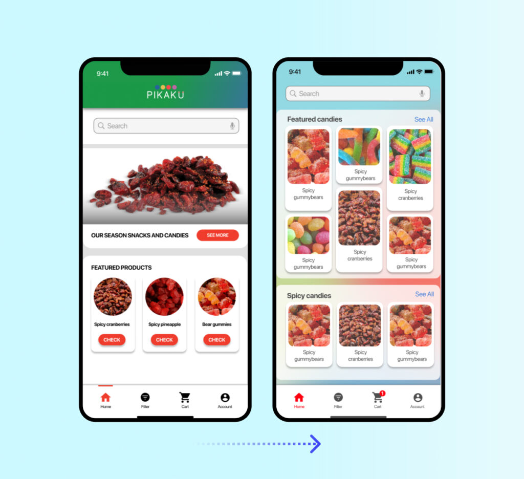
HOME AND LISTED PRODUCTS
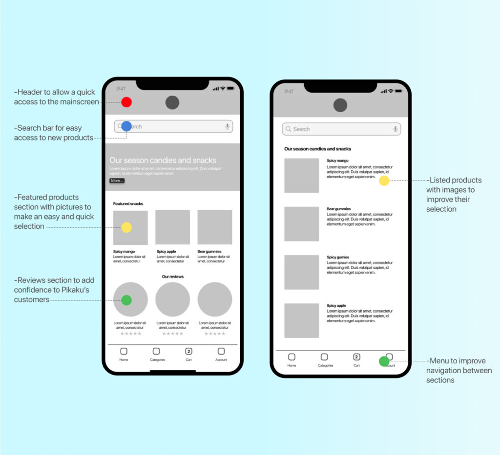
After designing the main wireframes on paper, the next part of the process was digitalizing and starting different wireframes to decide which could be a convenient configuration for the user, after many iterations, it was found that a minimal home screen could improve readability because of this the screen was divided into five sections: a header, a search bar, season candies, featured products and a review section. Below the application, it was added a menu section to improve navigation and the images were sized to 100px per 100px to help the user to select and visualize products.
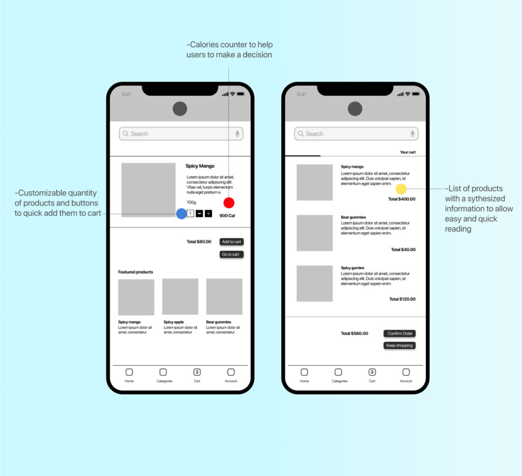
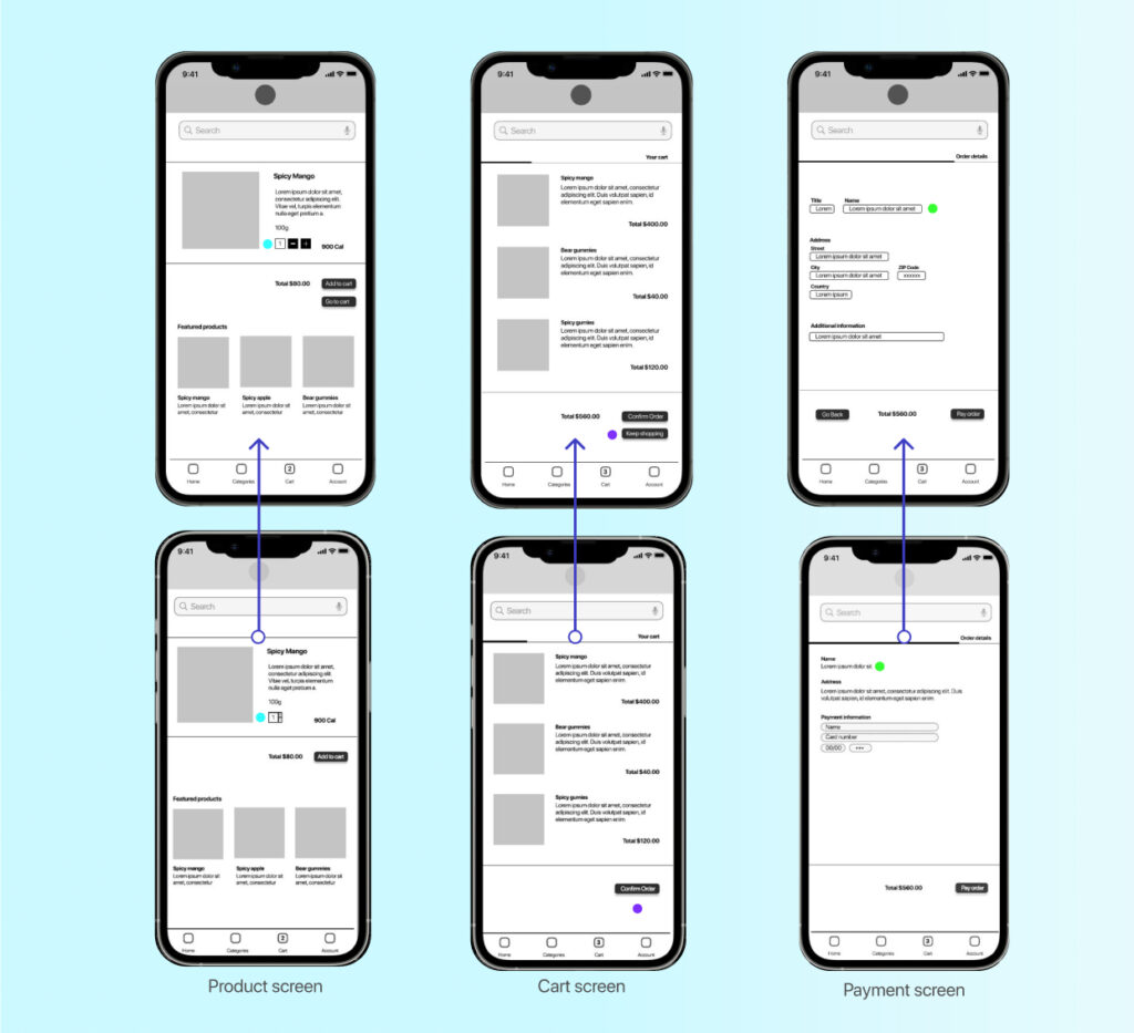
PRODUCT AND CART SCREEN
After many iterations, more screens were designed and a calories counter and buttons were added to edit the quantity of products. Another screen that was re-designed several times was the cart screen to allow users an easier flow, so it was added a section with the products listed and with visual help to make a more agile slection.
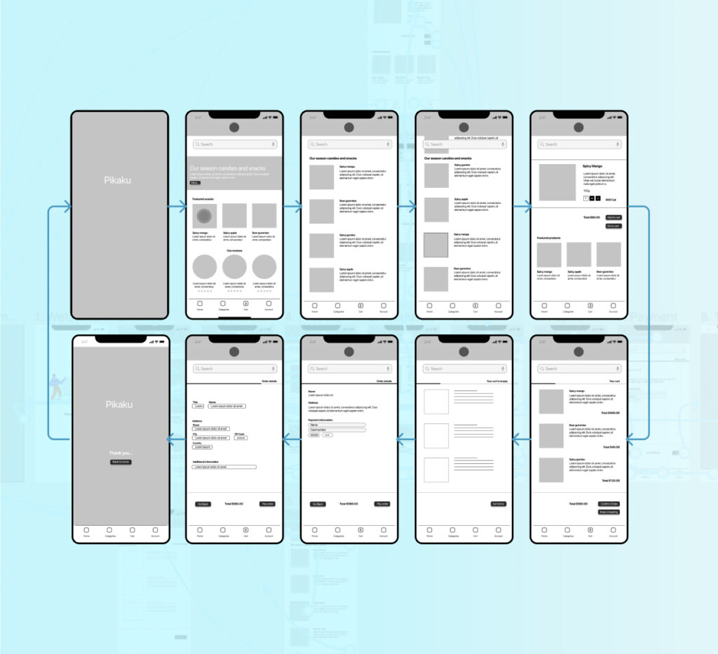
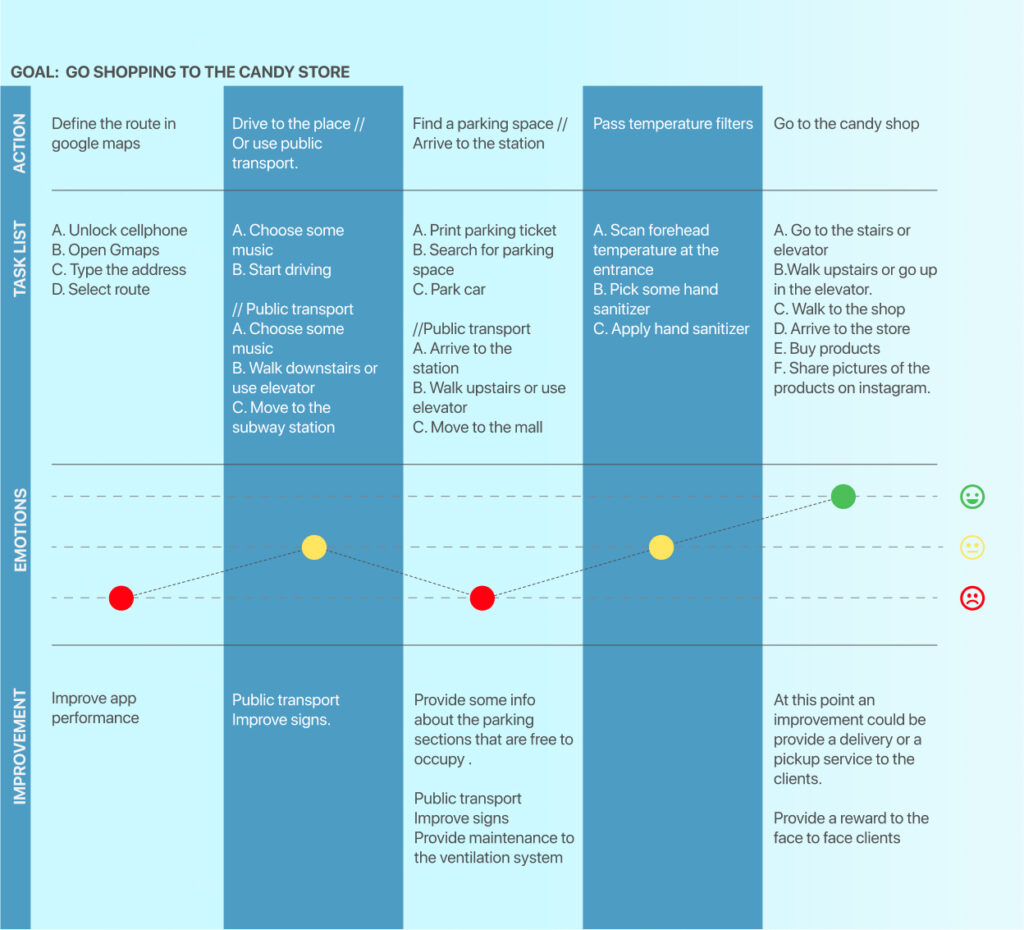
MAIN FLOW
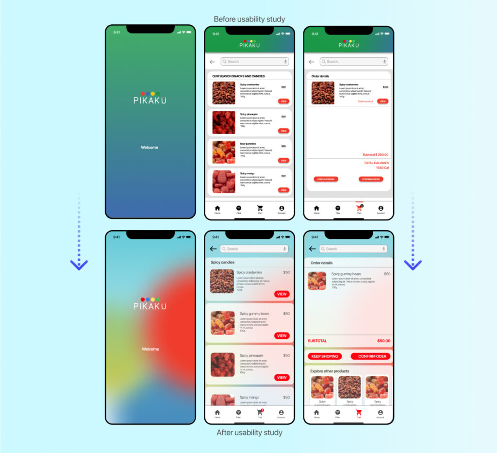
Once the screens were designed, the next step was planning the interaction between screens. The objective of the main flow was to finish the buying process of a product and go to the main screen again. This process allowed us to find the pain points and make some adjustments in the product interactions.
After two rounds of the study the users pointed out some improvements:
-Size of buttons
-Payment section
-Navigation details
FINDINGS AND ADJUSTMENTS
As mentioned before, the screens that reported usability issues were the product, cart, and payment screens.
To resolve this in the product screen the size of the buttons to add and subtract products was modified(1), in the cart screen (2) the navigation was improved to allow users to keep shopping and the payment section (3) was improved by allowing the user to change payment methods and the information was divided by chunks to help user to focus in small steps of information.


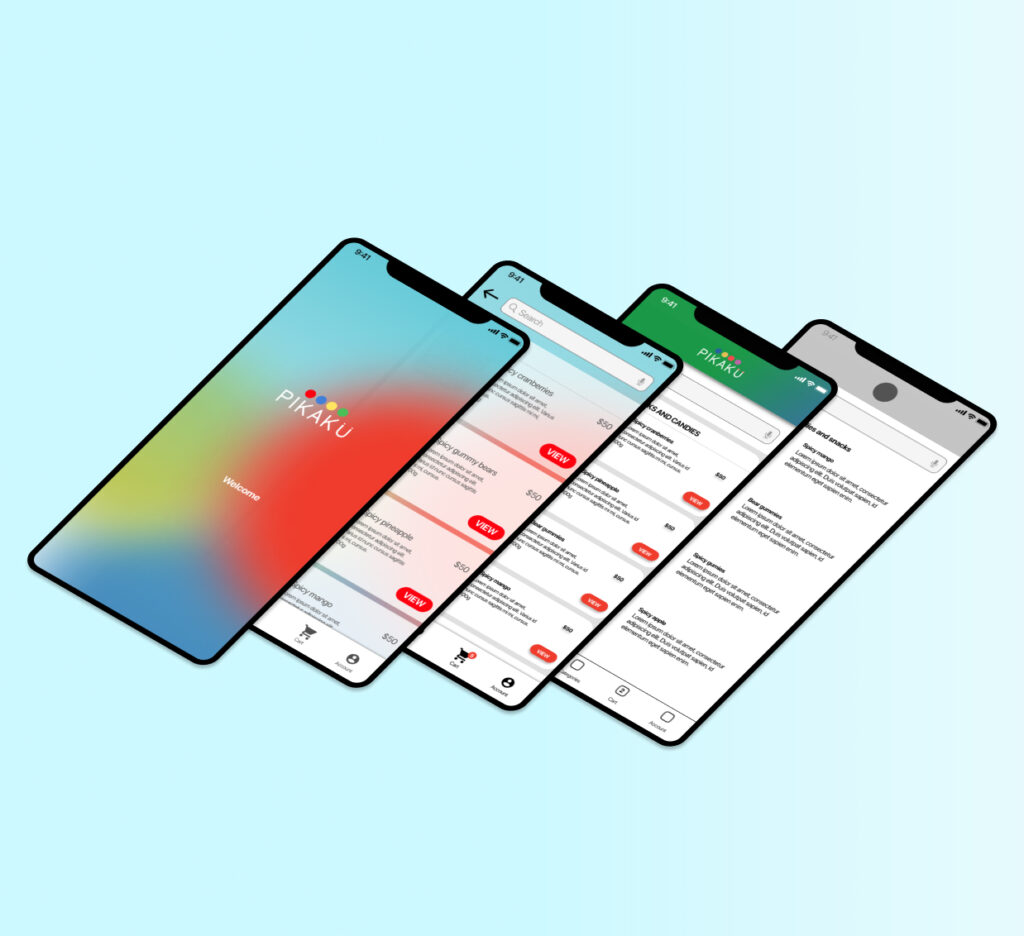
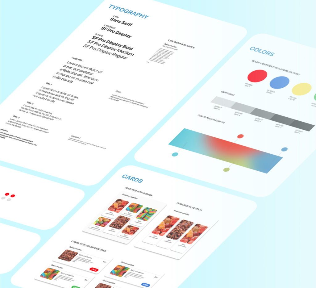
MOCKUPS
FINAL DESIGN


THANK
YOU!
Thank you for reviewing my project!
If you’d like to see more or get in touch, feel free to reach out to me 😉
hello@imaluis.com